
CSS transitions allow you to smoothly alter property values over a specified duration of time, adding a level of sophistication and interactivity to your web pages. In this guide, we’ll dive into the key concepts, syntax, and examples of using CSS transitions effectively.
CSS Transition Synopsis
1. Introduction to CSS Transitions
CSS transitions enable the smooth change of property values over a given duration. To create a transition effect, you need to specify two main things:
- The CSS property you want to add an effect to.
- The duration of the effect.
Note: If the duration is not specified, the transition will have no effect, as the default value is 0.
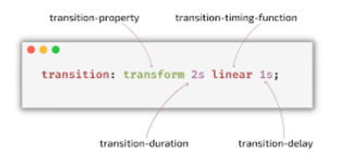
2. Basic Syntax of CSS Transitions
The basic syntax for a CSS transition is as follows:
transition: property duration timing-function delay;Example:
div {
  width: 100px;
  height: 100px;
  background: red;
  transition: width 5s;
}

div:hover {
  width: 300px;
}
In this example, the width of the <div> element transitions from 100px to 300px over 5 seconds when the user hovers over it.
3. Transition Delay
The transition-delay property specifies the duration to wait before starting a property’s transition effect when its value changes.
Delay Values:
- 0s (or 0ms): The transition effect begins immediately.
- Positive Value: Delays the start of the transition effect for the given length of time.
- Negative Value: Begins the transition effect immediately, partway through the effect.
Syntax:
transition-delay: 3s;
transition-delay: 2s, 4ms;
Example:
div {
  width: 100px;
  height: 100px;
  background: red;
  transition: width 2s, height 4s;
  transition-delay: 1s;
}

div:hover {
  width: 300px;
  height: 300px;
}
In this example, there is a 1-second delay before the width transition starts, and the height transition takes 4 seconds to complete.
4. Transition Duration
The transition-duration property specifies how many seconds (s) or milliseconds (ms) a transition effect takes to complete.
Syntax:
transition-duration: time|initial|inherit;Example:
div {
  transition-duration: 5s;
}
5. Transition Timing Function
The transition-timing-function property specifies the speed curve of the transition effect. This property allows you to define the acceleration pattern of the transition.
Common Values:
- ease: Starts slowly, then fast, then ends slowly (default).
- linear: Same speed from start to end.
- ease-in: Starts slowly and ends fast.
- ease-out: Starts fast and ends slowly.
- ease-in-out: Starts and ends slowly.
- cubic-bezier(n,n,n,n): Define your own values in the cubic-bezier function.
Example:
div {
  transition: width 2s ease-in-out;
}

div:hover {
  width: 300px;
}
6. Transition Property
The transition-property specifies the name of the CSS property to which the transition effect is applied. The transition effect will start when the specified CSS property changes.
Syntax:
transition-property: property-name;Example:
div {
  transition-property: width, height;
}

div:hover {
  width: 300px;
  height: 300px;
}
7. Putting It All Together
Let’s combine everything we’ve learned into a comprehensive example. We’ll create a <div> element that changes size, background color, and position smoothly when hovered over.
HTML:
<!DOCTYPE html>
<html>
<head>
<style>
  div {
    width: 100px;
    height: 100px;
    background: red;
    position: relative;
    transition: width 2s ease-in-out, height 4s, background 1s, left 2s;
    transition-delay: 1s;
  }

  div:hover {
    width: 300px;
    height: 300px;
    background: blue;
    left: 200px;
  }
</style>
</head>
<body>

<h1>The Transition Bros</h1>
<p>Hover over the div element below, to see the transition effect:</p>
<div></div>

</body>
</html>
Explanation:
- The
divelement initially has a width and height of 100px, a red background, and is positioned relatively. - When hovered over, the
divchanges its width to 300px, height to 300px, background to blue, and moves 200px to the right. - The transitions for width and left properties are applied with a 2-second duration and
ease-in-outtiming function. - The height transition takes 4 seconds, and the background transition takes 1 second.
- There is a 1-second delay before the transitions start.
READ: Text Color by UDEMIE: HTML and CSS Applications
Read CSS transition online
You can use the link below to read css transition oline


